Promote new customer conversion, preserve existing customer loyalty and provide a Best-In-Class Online experience by reducing frustration, increasing delight and empowering customers.
Defining Expectations
Project
Check Into Cash Redesign and Design System
Roles
Lead UX Designer, Researcher, Project Manager and Owner, XD Mentor
Timeline
2 Years (2019-2021) for creation of design system.
Tools
Figma, TeaLeaf (Acoustic), Adobe Creative Suite, UserTesting, Google Forms Wordpress, Loom
Best In Class Financial Tools
How can we improve usability and simplicity for the customers learning about, applying for and managing personal loans from Check Into Cash?
Compliance and Accessibility
How do we make WCAG and ADA standards inherent to the methodologies of design and development?

Brand Consistency
How do we keep design stability for a 25 year old brand across marketing and affiliate teams?

Doing the Research
Finding the Opportunities
User Offerings
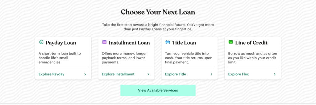
Researched the various loan products to understand how customers would utilize the varying amounts and terms.
Peer Review
Analyzed sites and applications of 6 different direct competitors. Reviewed financial tool offerings of 4 indirect financial peers.
Personas
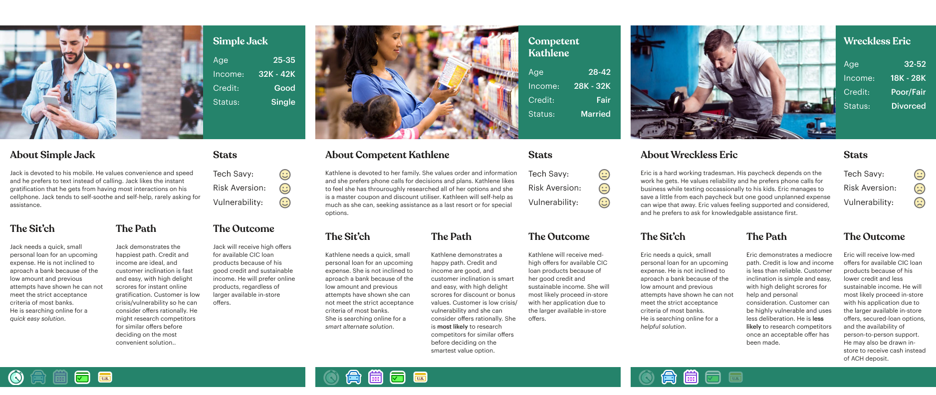
Created Three emerging personas using customer data, observed customer interactions (tea leaf) and card sorting for user demographics as well as online vs retail.
Mapping
Focused mapping on understanding the loan application process, studying current financial account offerings and empathizing with customer feelings, thoughts and actions throughout the various interactions.
Personas
Empathy Map

Opportunities for Success
Comforting Tones
Users respond to a personal touch with friendly language that lends confidence to a stressful mindset.
Simplify Application
Using conversational prompts and clear progress indicator, guide the customer through their online loan application in the same manner that is so successful in the retail stores.
Enhance Account
Expanding the functionality of the customer account would enable ownership of their funds, enable painless repeat applications, and enrich user data for marketing and future feature building.
Mobile First
Building a prioritized mobile experience was a priority based on user data revealing a 70-80% mobile audience on any given day.
Design
Designing the Experience
Wireframes
I created the hypothetical experiences in order to test it against the empathy map as well as the legal and tech requirements.
High Fidelity
Using the branded design system, I converted the wireframes from low to high fidelity designs.
Accessibility
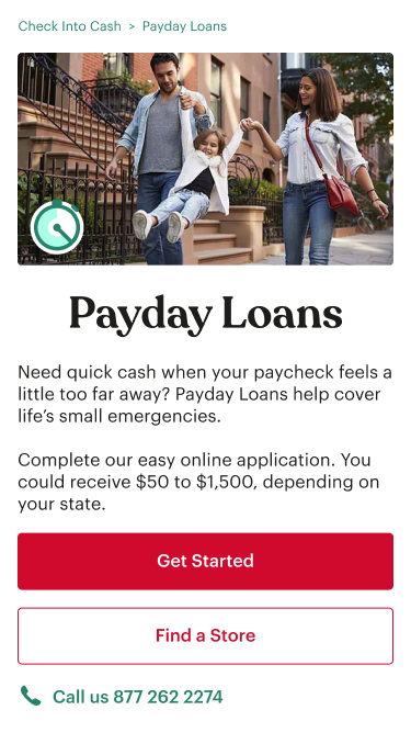
I created a color palette system that would allow super fast, accessibility-compliant choices by designers and developers.
Prototypes
Using my Figma designs, I created a working prototype to first present to stake holders and then to use in testing.
Usability
I ran superficial usability tests across the full experiences and focused usability tests for problematic or complex processes within the application.
Wireframes
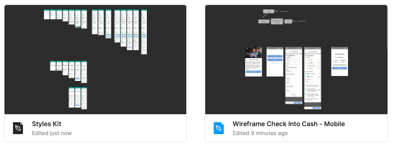
I created a smaller wireframing design system in Figma to produce the experience wireframes and build a low fidelity prototype for early testing.
High Fidelity Designs
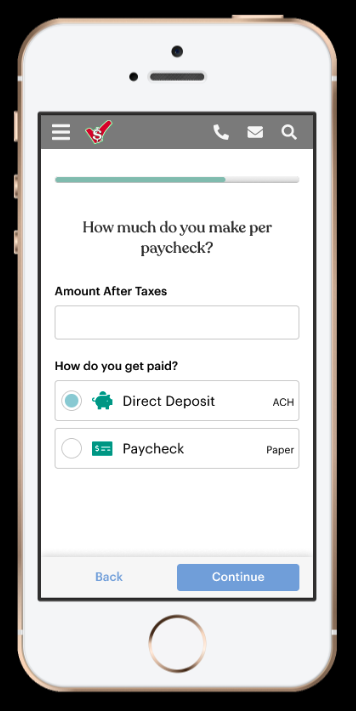
Using the design system and wireframes, I produced working experiences for the website, application and various loan accounts.
Mobile First
I produced mobile views first to enforce the priority experience.
Friendly Language
I changed dry instructional prompts into conversational requests and injected more personal tones.
Educate Users
I set strict and consistent style usage rules to create and reinforce priority actions without confusion.
Accessibility
Our business goal was to achieve AA and AAA compliance.
Mathmatical Colors
I expanded brand colors into 10 tints. For a 4.5 contrast ration (AA), the foreground and the background colors needed a numerical difference of 50 or more.
Clear Actions
I chose languages for actions and buttons that were clear and set appropriate expectations.
Aria and Alt
I performed “readings” with different team members of the experiences to achieve the necessary clarity for screen readers.
Prototypes
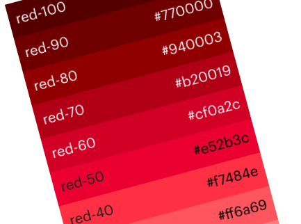
To prove the product, I created functional prototypes in Figma for stakeholder interaction and usability testing.

Usability Testing
Various methods of testing were used to measure success.
Successful Completion
Fully prototyped experiences were shared with users to see how they completed the journey through a full process.
Focused Tasks
Within each experience, I evaluated certain points that could pose as heavier cognitive burdens. I performed more intimate moderated tests for these specifically.
Usability Findings
Increased Speed
Users were able to complete guided interactions up to 60% faster.
Fewer Mistakes
Simplifying and homogenizing the legal documentation allowed users to “auto-pilot” through the disclosures faster and more correctly.
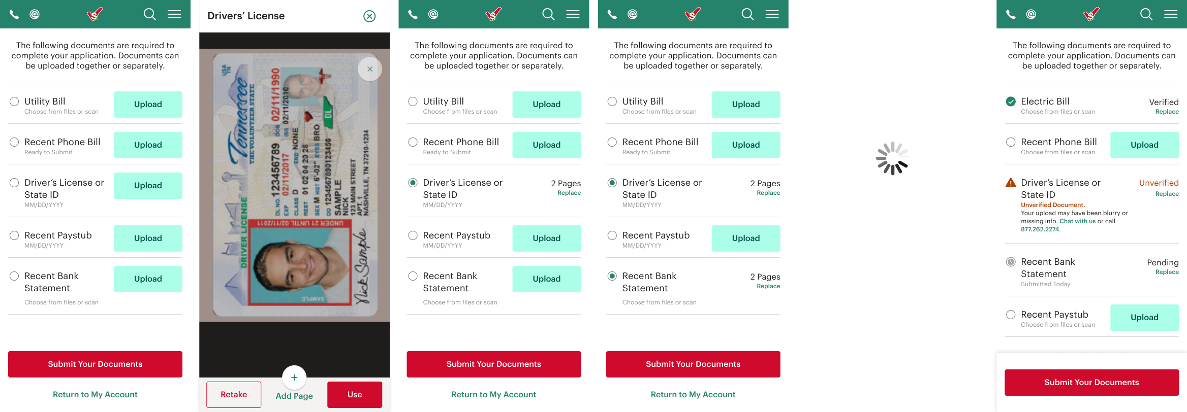
Upload vs Submit
Users understood intuitively all actions to upload and submit documents, however, they became consistently confused about the status of those documents. Rework of the design was necessary.
Wrap Up
After Rework, I prepared the design system and design files for handoff. I created a documentation site where I recorded element names, usage rules, placement rules, and WCAG/ADA rules for all library elements. I also created Loom tutorial videos to mentor design system users on Atomic Design Theory, accessibility goals and methods, and using Figma to examine designs for code production.
Reflections
Support and
Advocacy
Stakeholders were allies on this project, allowing priorities to fall on good design, good data mining, and thorough testing. Ample time was given for all phases, and extended when necessary.
Evolution of a
Design System
I exceeded my original timeline for the Foundations library while trying to build developer methods and accessibility compliance into the elements. I underestimated the strategy needed for this initial push.
Rapid Iteration
on the Future
Two years after the site launch, iterations in the design system continue. It allows incredible design speed for cross-team projects such as feature building and marketing promotions.