Provide Users with an Improved Experience that Allows Them to Quickly and Confidently Back Up their Intuit Data.
Defining Expectations
Project
Intuit Data Protect
Roles
Lead UX Designer, Researcher
Timeline
3 Months (2011)
Tools
Adobe Creative Suite, Google Slides, Google Forms, Intuit User Recruitment
Reassure Users That Data Is Safe
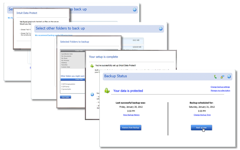
How can we provide users with the confidence that their data is secure and current? The original tool suffered from a lack of clear successful completion indicators. There was little confidence in the tool's successful automatic backups, no indication of the time of the last back up, and users choosing to back up manually were not given any visual cues that the backup happened or was successful.
Guide New Users into the Tool Quickly
How do we get new users in and backed up quickly and painlessly? The original tool required 6 steps to initiate new users, without clear indicators that their data was successfully backed up how to set up automatic backups.
Clearly Indicate Back Up Errors and Next Steps
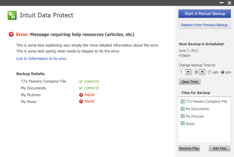
How do we communicate with users when an error occurs and what they can do to resolve it? The original tool had very little error handling and did not use good design (color theory, font design, visual cues) to express that the backup needed attention or that the latest data was not protected.

Doing the Research
Finding the Opportunities
Interviews
I interviewed current users to discover areas of confusion and frustration.
Flows
I created user flows, based on required steps, to reduce set up efforts and find more efficient paths to set up automatic backups and manual backups.
Color Theory
I defined color theories to educate users for success, errors, ready-status and customization actions.
Opportunities for Success
New User Setup
After defining the set up requirements for new users, I was able to create a single screen to achieve all needed actions.
Single-Screen App
The single screen setup evolved the entire tool into a single screen application, due to reusable prompts and actionable zones for all users.
Color Assignments
The original tool was monochromatic blue, with very little to indicate to the user eye what was happening or priority. I assigned new colors to indicate different states and priorities.
Error Resolution
I created UX patterns that would clearly show how and where errors occurred. I also added language to give users next steps and methods to resolve the errors.
Design
Designing the Experience
Wireframes
I created wireframes from the required flow to test the single-screen app success.
High Fidelity
I designed high fidelity screens for each wireframe using the new color assignments, font-size hierarchy, action zones and user notifications.
Prototypes
I created a prototype from the high fidelity designs for stakeholder review and for usability testing.
Usability
I invited a segment of the interviewees back to test the prototype.
High Fidelity Designs
The first part of the solutions was to make the First Time User Set Up a smoother and more automated process.
Automation Added
The application automatically selects eligible files for backup, visually leads the user through the automated process of validating connections and account setup. The interface is a single page application and the buttons and functions that are not available to new users are disabled.
Reassuring Success
The setup proceeds by showing successul steps completed and then active progress of the users files going up to the server. Completion and time to completion lend the user confidence that the application is working.The user has not yet hit a button and already their primary company file has been backed up.

The Next pain point was to reassure users that data was safe and current.
Successful Automatic Backup
One of the biggest issues with users was the ambiguity of their automatic backup. The new Home screen prioritizes the success of any automatic activity using fonts, colors and icons to reassure the user.
Manual Backup
The tool is designed to perform automatically, but for the users needing to occasionally back up their data manually, I added the "Big Blue Button" and used similar progress indicators as for the new user set up.

The Last pain point was to clearly indicate errors and offer users solutions.
Grabbing Attention
Errors are expressed in the priority headline. Users are given clear and iconic error messaging using icons, color and bolding. The previous system error codes are now expressed in plain language.
Offering Help
With the newly prioritized error messaging, the user is offered a solution or next step to begin resolving the error. A link to the Knowledgebase article for that specific error is offered, where the user will find helpful information as well as customer support methods.

Wrap Up
After usability studies resulted in high success on all objectives, I prepared the materials for dev handoff. The product was updated and implemented in the intuit cloud, available to 58 of the then 72 Quickbooks products.