WCAG/ADA in a Design System
Goal:
Mission
Contrast Ratio: defined
The contrast ratio is taken from the contrast difference between colors used for text/foreground and background.
WCAG 2.0 level AA requires a contrast ratio of at least 4.5:1 for normal text and 3:1 for large text.
WCAG 2.1 requires a contrast ratio of at least 3:1 for graphics and user interface components (such as form input borders).
WCAG Level AAA requires a contrast ratio of at least 7:1 for normal text and 4.5:1 for large text.
Large text is defined as 18px and bold or larger, or 24px or larger.
The Method
How do we make this simpler? Math!
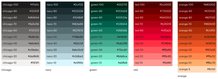
Each basic color is broken down into TINTS across a 10 point/percent value system, white being 0 (zero), the lightest tint of 10% being "-10" and the tint of that color closest to black being "-100". If done correctly, the "-50" tint should have a contrast ration of 5:1 from white(0) and from the darkest tint(100).

By assigning numeric values to the tints, a designer or developer can now use simple addition and subtraction to know if a contrast ratio is compliant. For example, if the contrast ratio is 4.5:1, we multiply by 10 (45) and then we select color values with this mathematical difference or greater. To further simplify, I set simple values of 60/10 for the 4.5:1 ratio and 80/10 for the 7:1 ratio.

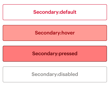
Top Default State: red-60 text on white (0)
Difference of 60.
Hover state: red-70 text on red-10 background
Difference of 60.
Pressed state: red-80 text on red-20 background
Difference of 60.
Disabled state: gray-60 text on white (0)
Difference of 60.
Additional Visual Clues
Another quick reference for the team was to visually demonstrate dark and light usages of the colors. In the tint color columns, text is placed as white or black to show which usage is most appropriate.
