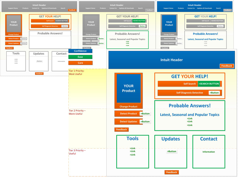
While at Intuit, I worked on the Triple Crown project, an initiative to focus our offerings on care, confidence and ease. As some of my earliest UX work, I build artifacts to help different business teams understand how these three mission values were used on the site.
Showing Care
Care is about personalization. Users need to feel that Intuit cares about their personal needs, knows their personal products and offers them various ways to get the solutions they care about themselves.
Product detection, update detection and user feedback are different ways that users and Intuit communicate personally with each other about support.
Showing Confidence
Users gain confidence by recognizing that the help they need is available. The help they need is based on their product, so product recognition is a key element (see Care). Seasonal offerings are always confidence lending, allowing users to get to the most relevant answers without a tedious search. Other offerings such as tools, updates and customer service information allow users a variety of solutions all on one page. Users can quickly find the help they need and then get back to their actual business.
Showing Ease
With so many products and so many support options, it is most important to make the site experience easy to use and understand. Prioritizing information, bucketing information and clear, prioritized actions create ease for users. Prioritization of information, clear zoning of information and CTA color and size allow a user clarity and success.
Put Them All Together
When combined, we had a method for building out both a site front door, for users entering without product detection, and product based home pages for users with established identities.
Creating seperate wireframes and then overlaying them allowed teams to understand how to map and plan the site to optimize the end users experience.
